Understanding Colour Psychology in Marketing and Branding
Have any questions?
Just contact us below, our
team is always ready to help.
The psychology of color is highly significant when it comes to marketing and branding.
Colors influence how a consumer will view the personality and representation of the brand so it’s important to understand the colors that showcase your brand, to make sure you make the best first impression you can.
At Bold x Collective, our team specializes in brand development and marketing. We thoroughly understand the importance of color psychology and its representation in marketing and branding. With every branding project we pursue, color theory is one of the key components we focus on as an agency.
Let’s take a more in-depth look at what color psychology is, and how you can use it in marketing and branding.
What Is Colour Psychology?
Color psychology is the study of how colors affect human emotions and behaviors. When it comes to your consumers, color psychology will impact their impression of your brand, whether you are launching a new business, pursuing a rebranding project, or even creating marketing assets.
Many believe that colors can evoke certain emotions that are linked to memories that we have of those specific tones throughout our lives. For example, many individuals that have swum in the ocean find it calming, hence blue is often associated with feelings of tranquility and stability. Also, when it comes to looking at the yellow sun, we tend to feel warmth and peace.
How Does Colour Psychology Tie In with Marketing and Branding?
An effective marketing campaign will create a connection between your brand and the consumer. This can build brand awareness and loyalty. As a brand, this information is valuable, and you want to ensure you have a strategy behind the colors you want to use to connect with your target audience and inspire them to connect with your brand.
Understanding the psychology behind colors and using the right ones for your brand will help you build your audience and drive conversions.
Colours Will Help You Build a Memorable Brand
Colour is a powerful tool when it comes to branding. Consumers can identify a brand just because of its logo.
For example, when you see Coca-Cola with its red color, you will immediately know what the brand is, because that is their consistent color. When you see the M from McDonald’s, you’ll instantly know that it is the McDonalds logo – the happy, kid-friendly place.
Colours Can Improve Your Conversion Rate
Did you know colors can help your audience act?
Have you ever noticed that when there is a red light, you stop, and when there is a green light, you go? Human behavior is programmed to respond to color.
By putting thought into choosing the right colors, you can drive your viewers to become customers. Many advertisers like our team at Bold x Collective have performed A/B testing, which has shown that the color of a button on a website can increase conversions. In a test by HubSpot, they said that changing the color of their button increased their conversion rate by 21%.
Now let’s take look at the different colors and what each one represents.
Red
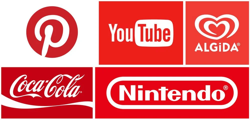
Red incites intensity in all forms of the word. When you think of red, what kinds of brands come to mind? Coca-Cola, CNN, Nintendo, and Lego all use red in their logo designs.
These logos are not owned by Bold x Collective, and are strictly used for educational purposes.
Coca-Cola is often advertised in sports commercials because they want it to be related to energy, action, excitement, and passion. Red also has the effect of encouraging appetite and you can see how that might benefit Coca-Cola.
CNN is a news company, so they want people to be alert when they are watching and be fully engaged with their content. Red being associated with excitement, passion and energy subconsciously makes their audience think that their content is important.
Nintendo and Lego’s audience are primarily children, and their products are very interactive video games and building blocks. Having their audience feel enhanced excitement, energy, and passion will only benefit them. Imagine if these brand logos were grey and dull. It would not have quite the same impact when going into one of their stores whether it’s in person or online, right?
One of the main aspects of red in terms of marketing is that it is a great call to action color. Many people associate red with “Stop” whether it be traffic lights, car brake lights, or stop signs. However, if you think about it, the fact that they use red to make people stop is already proof enough that it encourages people to act. People that invented stop signs and lights were already using color psychology! If you use it with your call to action, you will most likely see improved results. Be careful how you use it though because red can also be a sign of danger and deter people.
These logos are not owned by Bold x Collective, and are strictly used for educational purposes.
Orange
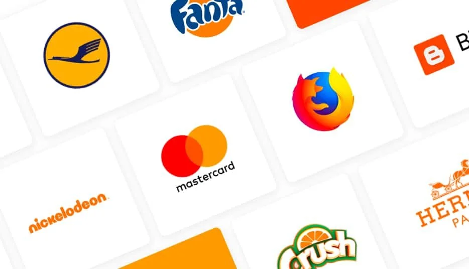
Orange is related to creativity, adventure, enthusiasm, success, and balance and is also often used for the call to action depending on what kind of emotions you want your consumers to feel when seeing it. Brands like Firefox, easyJet airlines, and Penguin Random House all utilize orange in their logos. Let’s break it down.
The Firefox brand logo is an orange fox that covers the globe. It is a search engine on the internet. Orange is related to adventure and enthusiasm is a great color choice for curious people that are looking for knowledge on the internet.
easyJet airlines is a company that literally helps people travel across the world. You can see how invoking the feeling of adventure and enthusiasm would benefit an airline company.
Penguin Random House is an American book publisher. Orange is related to creativity and success and a lot of people that are looking to get their books published will probably resonate slightly more with the color orange than other colors. They may also associate color with success. Everyone who writes a book wants their book to be successful as far as I know!
Orange is also a color that is often used for calls to action.
These logos are not owned by Bold x Collective, and are strictly used for educational purposes.
Yellow
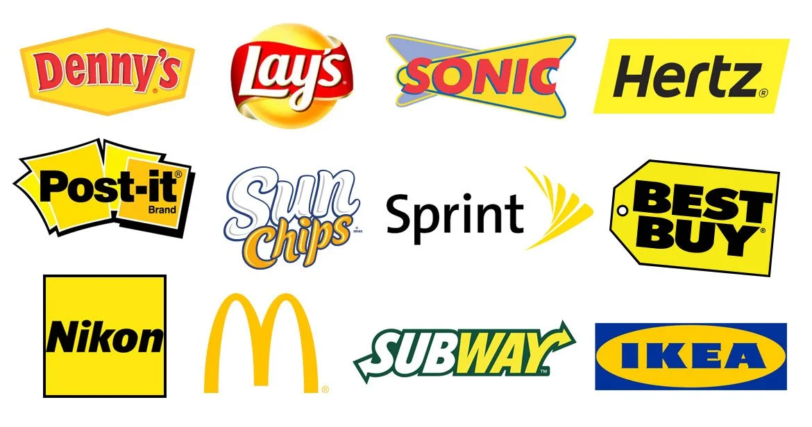
Yellow is usually associated with sunshine. When you think of sunshine on a day of a clear blue sky, you think of happiness, positivity, optimism, youthfulness, and summer. It can also be perceived as a warning or deceitful based on the content and tone and shade of the color. I bet you can think of at least one brand that uses yellow. Yup! McDonald’s is one. Best Buy and Nikon are other examples.
McDonald’s big “M” is yellow and because humans are visual creatures, they process the color of the M before its shape. Yellow also happens to be one of the most visible colors in daylight. That is why McDonald’s is very easy to spot on a road. People also associate happiness with it, which is probably why kids in the back seat of a car would scream for Mcdonald’s the same way they do when an ice cream truck drives by playing their songs on the road.
These logos are not owned by Bold x Collective, and are strictly used for educational purposes.
Pink
Pink is a color generally associated with femininity, playfulness, and unconditional love. There’s no argument as to why it’s often used for brands valentine’s day specials, wedding invitations, and anything that targets a female audience. Victoria’s Secret even named one of their brands Pink. Barbie also uses pink heavily.
Green
The first thing that comes to your mind when you think of green is trees and maybe money, so there’s no confusion as to why green is symbolic of nature, fertility, eternity, health, wealth, and generosity. It’s used by brands like John Deere, Whole Foods, and Perrier.
These logos are not owned by Bold x Collective, and are strictly used for educational purposes.
John Deere is an American company that manufactures and sells agricultural and forestry machinery and heavy equipment, diesel engines, and much more. They want to be related to nature as they are a company that caters to the needs of landscapers.
Whole Foods is obviously a brand that sells food and therefore they use green in their brand logo to relate to both health and nature. Many of those in the health and food industry will try to incorporate green in some aspects of their branding.
Perrier is a major bottled water company that most people have heard of. Water is known as the healthiest drink in the world and therefore, they are probably trying to symbolize eternity as water is known to increase your longevity. It’s also related to health and nature. When people buy water, they want to know it’s absent of chemicals and as fresh as possible.
These logos are not owned by Bold x Collective, and are strictly used for educational purposes.
Blue
Blue is an extremely powerful color to utilize in brand marketing. It’s associated with trust, harmony, stability, calm, and peace. Conversely, it can also represent coldness and depression. Brands that sell winter apparel can probably benefit from its cold trait. And industries that are specialized in psychiatry can probably utilize blue to represent depression and the fact they relate to people with that mental state. Some brands that use blue are Facebook, Visa, PayPal, American Express, Intel, and Dell.
Everyone knows about Facebook. Facebook would want its users to trust them. Harmony and stability are also something they would like their massive community to symbolize.
Visa, PayPal, and American Express are all payment systems that would again, highly benefit from their users trusting them.
Blue is also often used for technological brands as well. Intel, Dell, Nokia, and Samsung are examples. Consumers want their technology to be reliable and efficient. Even when you go to search for tech support, they generally utilize colors like blue for a calming and trusting feeling.
These logos are not owned by Bold x Collective, and are strictly used for educational purposes.
Purple
Purple is the color of royalty, power, nobility, luxury, wisdom, and spirituality. Due to this, if you overuse it for your brand, people may perceive it as arrogant. Brands generally use this color to make their offers seem prestigious.
These logos are not owned by Bold x Collective, and are strictly used for educational purposes.
White
White is usually related to innocence, goodness, cleanliness, and humility although in some parts of the world it can have negative connotations. White is also most frequently used to enhance spaces as it makes spaces look larger. On e-commerce websites, white tends to be the most used color. It also helps readability with its contrast with black.
These logos are not owned by Bold x Collective, and are strictly used for educational purposes.
Black
Black is the color of mystery, power, elegance, and sophistication. It’s the most used color in retail as these are all traits most retail stores like to be associated with. That is why the president or any major government official is driven in black limousines. Black, just like white is a neutral color and therefore, has a strong impact on spaces. Black can also cause sadness and anger depending on how it’s utilized.
Brands that use black in their logos are Nike, Hugo Boss, Ralph Lauren, and Jack Daniels. As you can see this, these are all retail brands that want to symbolize power. For Hugo Boss and Ralph Lauren, you can also associate it with mystery, elegance, and sophistication. Jack Daniels also probably tries to portray elegance and sophistication in its branding.
These logos are not owned by Bold x Collective, and are strictly used for educational purposes.
Grey
Grey is a color that represents neutrality and balance. It could also be related to depression and loss or used on products to appeal to a mass audience. Grey does not really evoke strong emotions and therefore, interior designers say that you should use it in spaces where you want employees to be impartial. You should use grey sparingly unless you are comparing products or services.
These logos are not owned by Bold x Collective, and are strictly used for educational purposes.
Brown
When you think of brown, generally you think of earth, wood, and stone. Just like green, it’s a very nature-oriented color. It also symbolizes comfort and security. It can be a good color to utilize if you’re in real estate, as people can connect it to homes. It’s also generally used by brands that sell natural products and food
Ready to Take Your Brand to the Next Level?
Colors influence how a consumer will view the personality and representation of your brand, so you want to ensure you make the best first impression you can.
At Bold x Collective, our team specializes in brand development and marketing. We thoroughly understand the importance of color psychology and its representation in marketing and branding. With every branding project we pursue, color theory is one of the most important factors we focus on as an agency.
If you are looking to set yourself apart from your competition, the Bold x Collective team is here to help you in that endeavour.

